OCTOBER 11, 2020 – For some weeks I’ve been planning signage for my tree garden—trail signs and markers designating regions where I’ve planted white pine seedlings. The project is a wonderful diversion from the discouraging plight of our country.
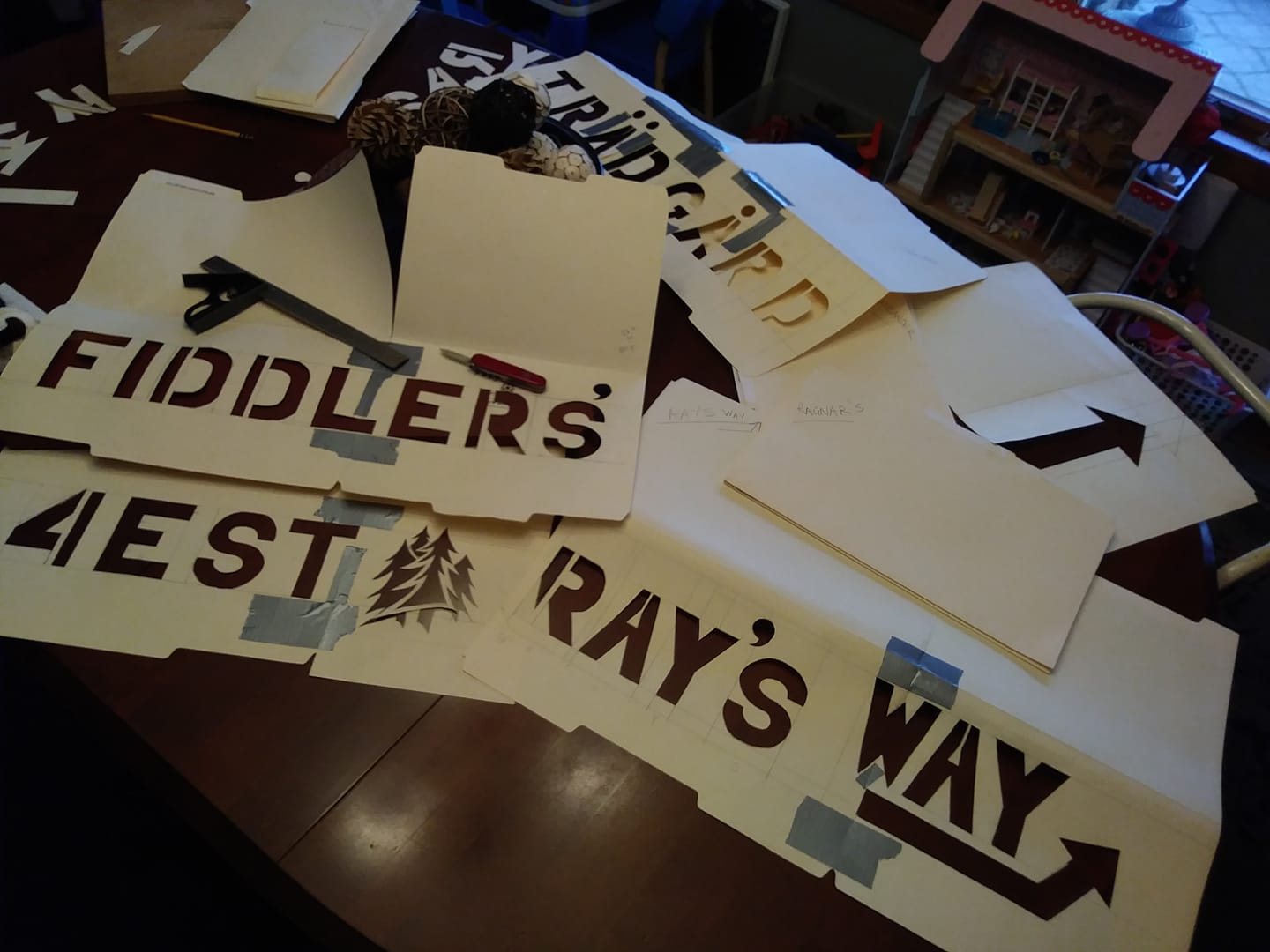
The signage has multiple facets: size, design, colors, materials, and most important, names and directional arrows. Besides the name of the garden itself—BJÖRNHOLM TRÄDGÅRD—a nod to my Swedish grandparents who acquired the land in 1939, I’ve devised references to the five generations of people and one dog that are part of the legacy of the land. A section of the garden that will one day be a white pine “mansion,” I’ve named “FIDDLERS’ 4EST,” reflecting my three sisters—all professional violinists—and me, the rank amateur. Our grandmother’s sister and her family, the Winthers, spent a lot of time at the lake in the early years, so another part of the garden is called, “WINTHER GREEN,” a double entendre reflecting the abundance of wintergreen in the area. The next generation, comprising six cousins, will have their section, called, “COUSINS’ CONIFERS.” Trails named after my grandparents are “RAGNAR’S WAY” and “HILDA’S MEANDER.” My dad is remembered by “RAY’S WAY” and my mother, by a glade called, “BOOTS’ BALM” (her nickname was “Boots”). A connecting trail will capture the family name of two Vietnamese brothers whom my parents took under wing in 1975: “VAN TRAN TRAIL.” To a trail section leading to the north end of the garden and replete with Norway pine seedlings I’ve assigned the name, “NOR – WAY.” A hillside loaded with up-and-coming pine will have a sign referring to the fifth generation of family tied to the land: “PENTA-GEN PINES.”
Our collie, who gave his name to the whole domain, will have the south-end trail named after him: “BJÖRN’S WALK” . . . or maybe, “BJÖRN’S RUN,” given how he loved to run free in our woods.
Each of the signs I’ve sketched will be stenciled, and I’m currently deep in the woods in this regard. I could buy stencils at an art shop, but I want to customize to such a degree, my only option is to design, draw, and cut each letter/arrow/icon myself. The process requires intense focus on proportions, measurements, precision cutting, and eventually, error-free painting. By trial and error and experimentation, I’ve devised all sorts of quirky techniques for quality control and desired outcomes.
Now I’m obsessed with signage. When looking at the cereal box over breakfast or observing signs while I’m out and about, I look for such things as “kerning,” a term well known to type-setters (I’ve learned) as the process of changing up spacing between letters to account for unequal spatial “volumes” of the letters themselves. Also, I’ve been alert to the average ratio of letter spacing to word spacing: three-to-one.
If you were to offer me ready-made stencils, I’d decline. I’m having too much fun developing a skill I never dreamed of needing or using.
And my new pre-occupation beats hands-down, cutting through the latest . . . news.
(Remember to subscribe to this blog and receive notifications of new posts by email.)
© 2020 by Eric Nilsson